
Zola Brand Development
Following a partial rebrand in 2016 when the company was still just a wedding registry, I spearheaded iterations to the visual brand that would allow for flexibility as the company added a suite of wedding planning tools. Colorful, playful visuals with a touch of humor were the guiding principles upon which the brand was developed. From propping with a cheeky cake topper to introducing bold colors to the traditionally light-hued wedding landscape, my aim was to build a visual brand as unique to the wedding space as the product itself.
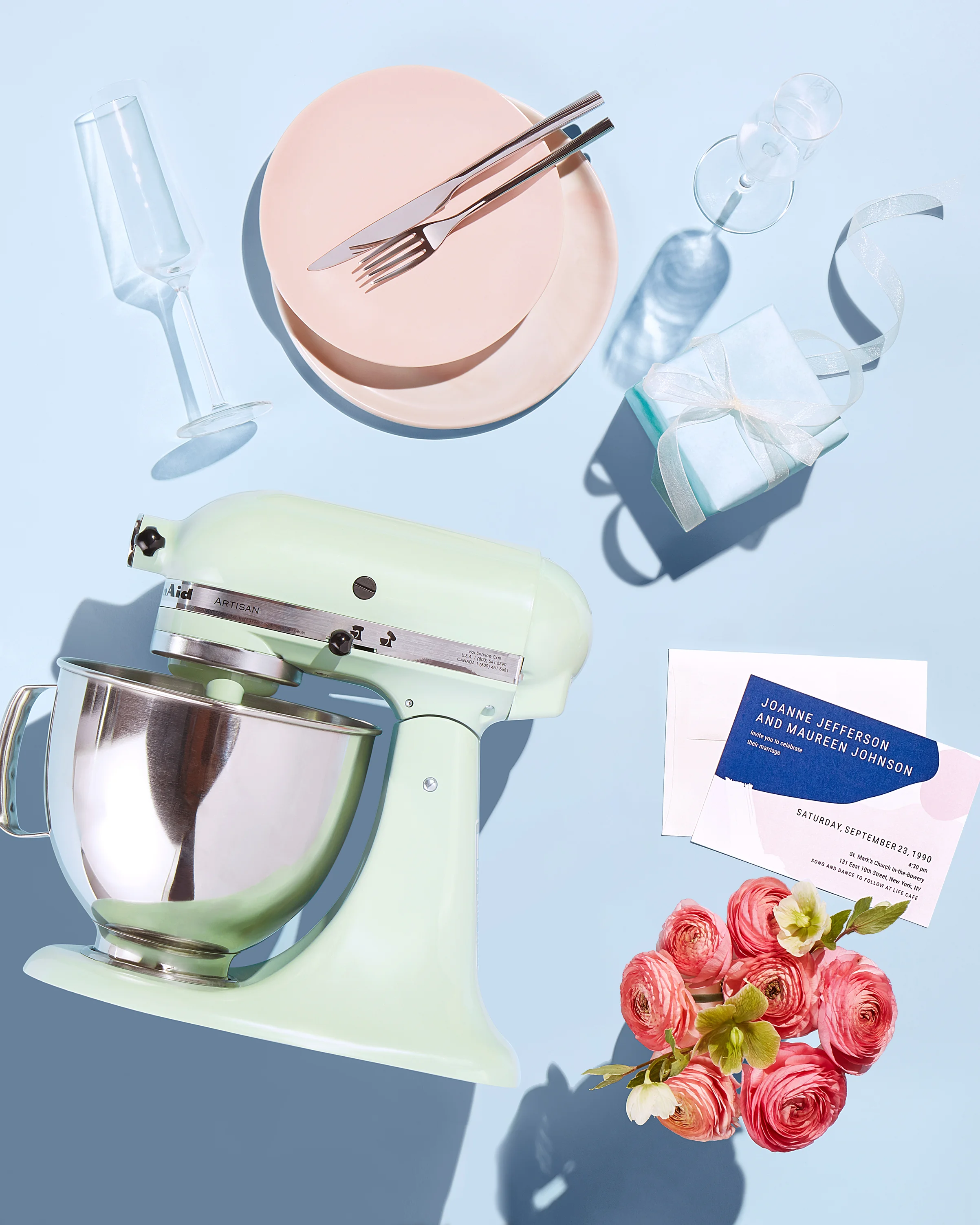
Photographer: Tom Medvedich / Prop Stylist: Jenna Tedesco
Working with illustrator Bailey Sullivan, I led the development of iconography that could unite a diverse range of products while maintaining the joy of the brand.


Photographer: Chaz Cruz


Photographer: Kelly Shea
In the absence of brand photography guidelines, I established photo direction and standards that satisfied Zola’s ever-expanding product offering and diverse range of photography needs.
As Zola’s creative lead, I established a visual direction that was in harmony with our joyful brand voice. Clarity was key in product photography: simple propping and straightforward angles that aligned with the modern feel of our site; while emotion took the forefront in couple’s photography: bright, natural lighting and a focus on intimate moments. Color, joy and playful details united Zola’s look across subjects and platforms.


Tasked with creating four videos in three weeks that would detail our core product offering, we partnered with the The Working Assembly to develop the videos just in time for engagement season. Featured here, our Invites + Paper and Wedding Website videos.


